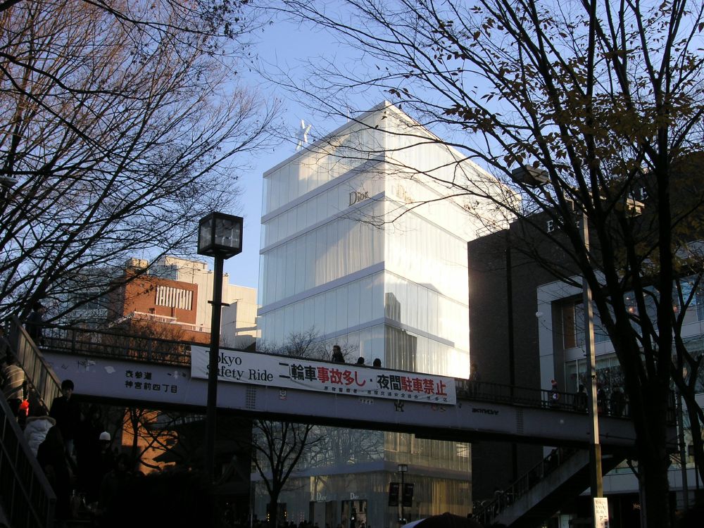
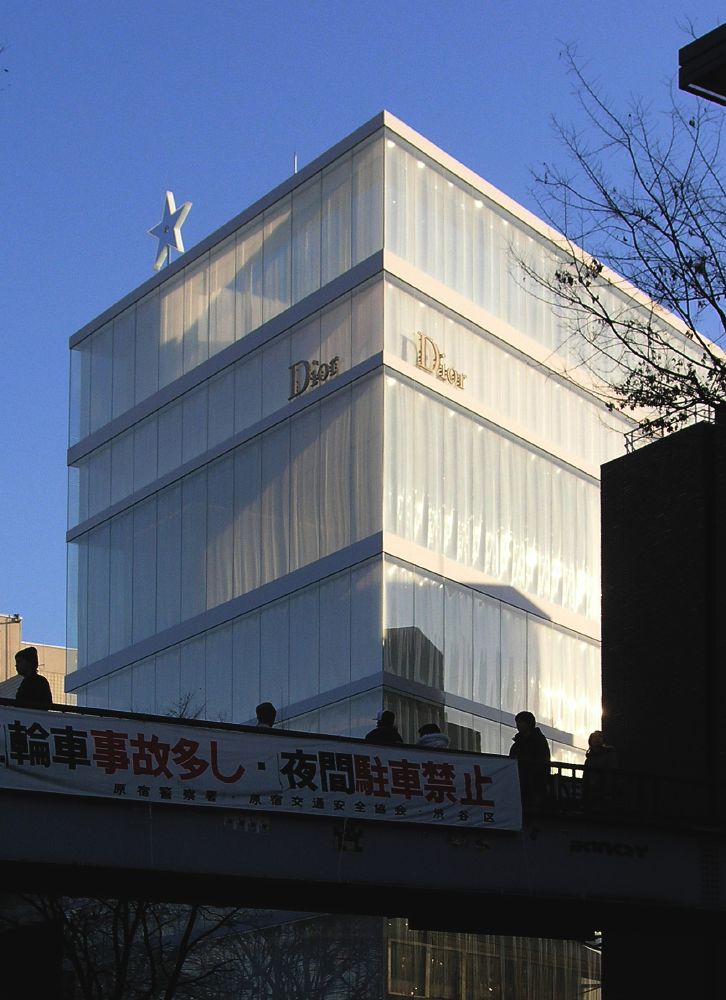
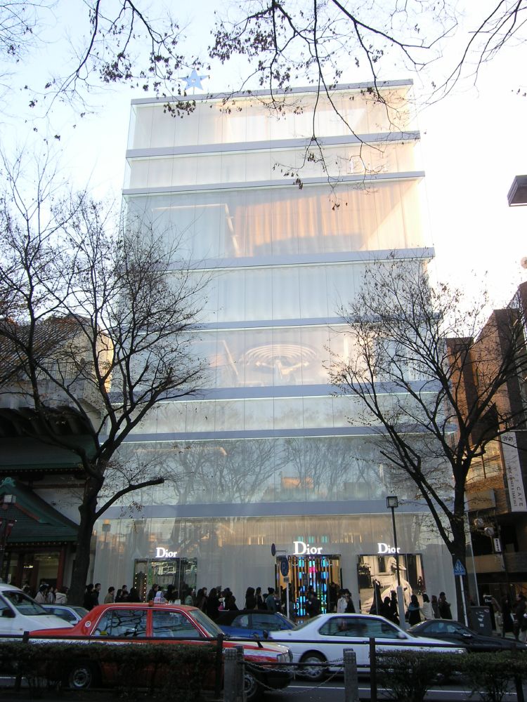
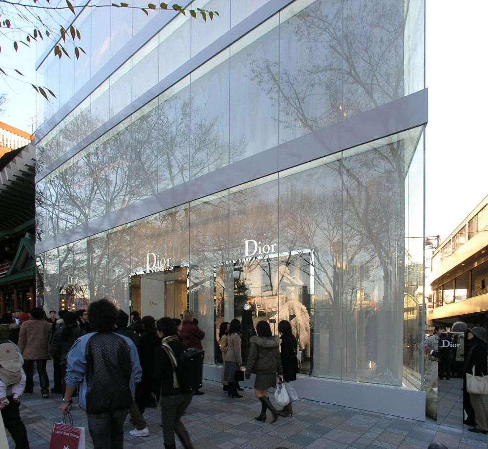
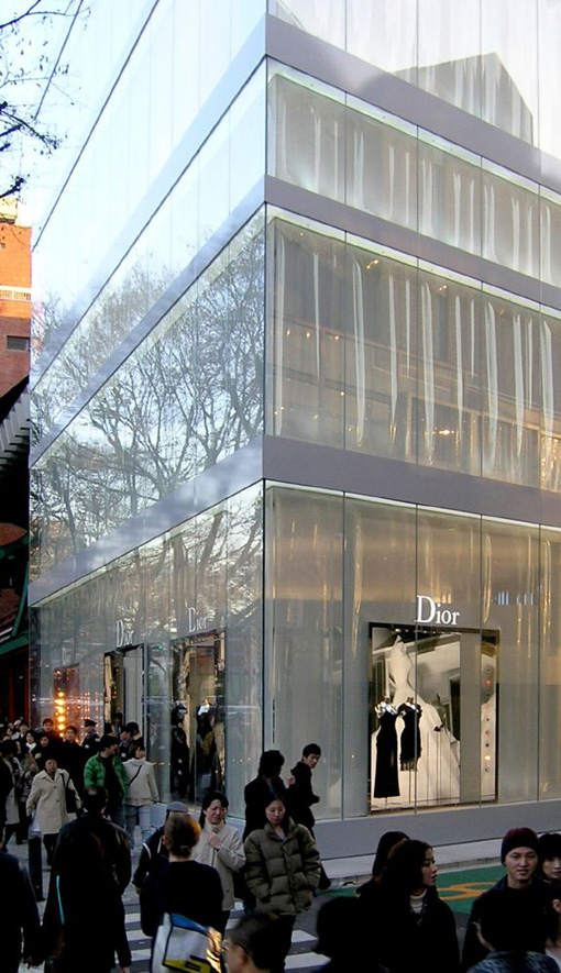
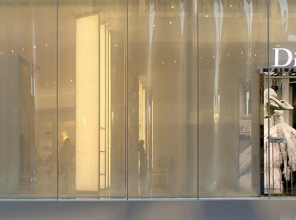
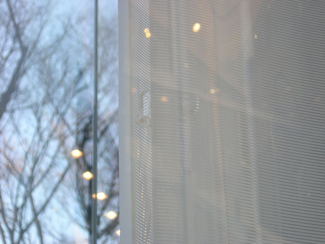
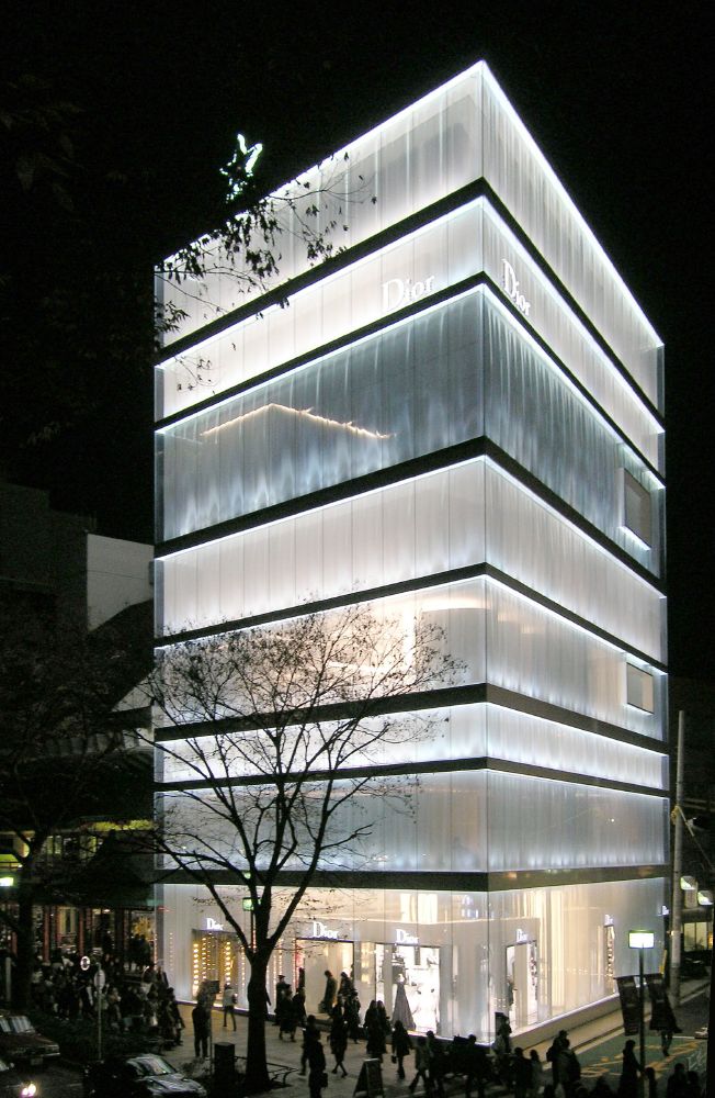
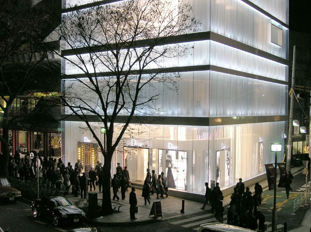
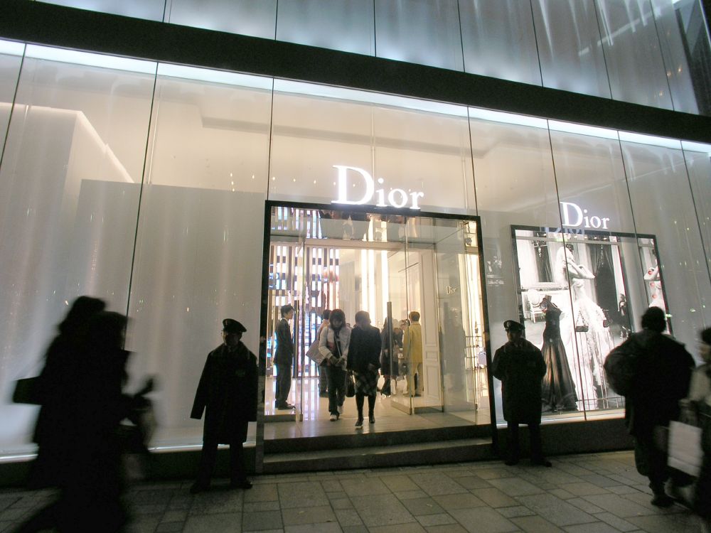
Starting from JR Harajuku Station I walked toward Omotesando. It came into sight in about five minutes. The first impression was " something shining". What is going on ? It looked white as if covered by a silk curtain. As I approached nearer, I saw that what looked like a curtain was a corrugated acrylic fiber board printed with fine white horizontal lines
It was such a simple building. The opaque color was beautiful.
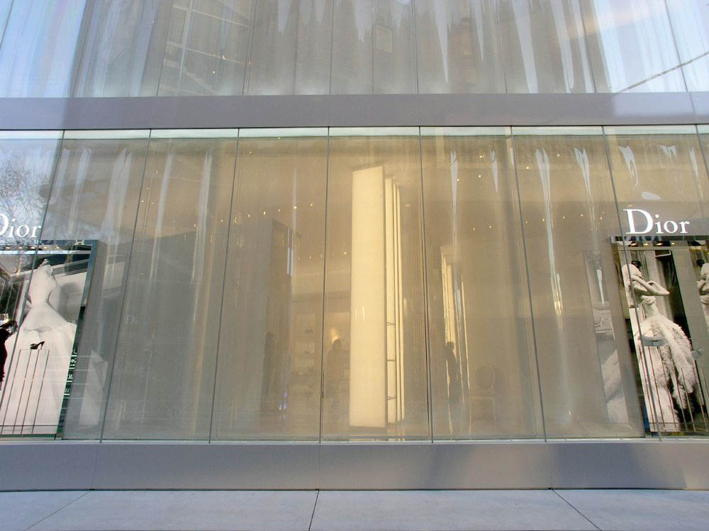
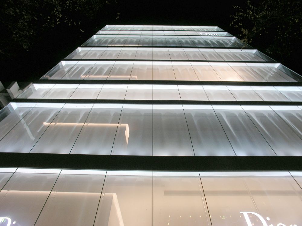
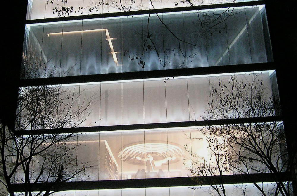
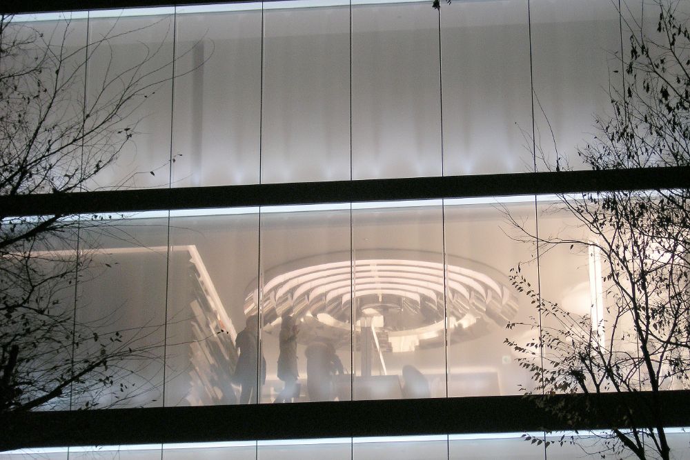
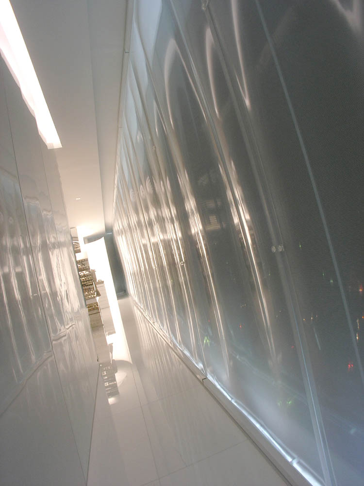
The ceiling space looked very shallow. Not all the floors were of the same height. One of them looked extremely shallow.
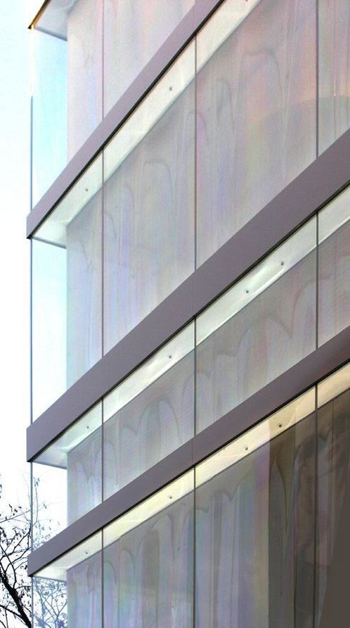
Although it looks simple, how it is presented is quite complicated. Or it is made simply producing complicating expressions.
Such variation of expression can only be expressed by photography. Furthermore, it must be pictures in big size.
The architectural design may be integrated as follows. The distorted acrylic fiber board had been used first in the pinball game center shop in Hitachi City. Producing the facade in large glass plane in opaque color began at Ginza Opaque. These attempts seem to have been united in this Dior building construction.
I noticed furthermore.
Generally speaking, people become aware of the building only when they come near the building such as nwhen they stand in front of an entrance. In case of a store building, it is the facade of first floor. Since the owner of a brand shop is well informed about this, it seems to be natural that even if he had asked the architect to design his store, he would have his own way of producing the facade of first floor. Most of the buildings on Omotesando are built that way. It seems to be the most important factor about producing the show window of the brand.
However, there are brand shops where architects have been entrusted to design even the facade of first floor. Such kind of buildings existing in Omotesando area recently are those of Dior and Prada Boutique Aoyama shop by Herzok& de Meuron.
What is common in these two ? Both buildings are totally designed by architects including the facade of first floor. And what is more, the continuity from the facade to upper floors seems to attract people's eyes to the whole facade of the building .
Although it is certainly a masterpiece presenting such variation of expression, it was rather unexpected to see the general drawings mentioned in the architectural magazine.
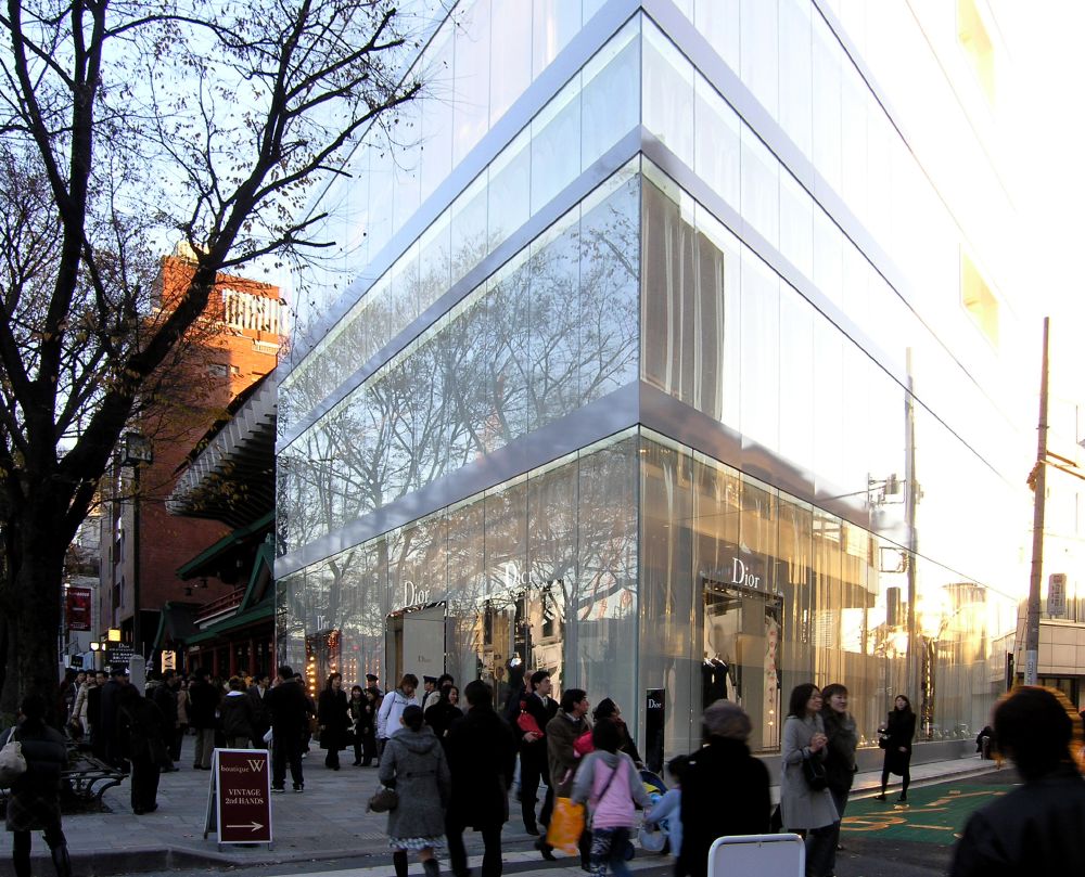
Naturally, when we inspect the general drawing of the building, we can recognize only a building set with a simple curtain wall.
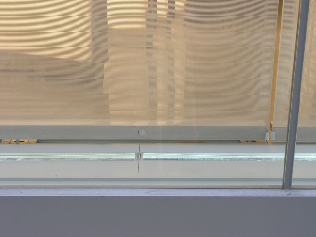
It is impossible to draw all the details on the general drawings, such as the interference fringe(white) of the acrylic fiber board, the rainbow colored lines, the large vertical wave, and the reflection of the wave on the acrylic board both in the daylight and in the night lighting. The architectural design has reached the area of expression which is impossible to figure out from what is shown on the general drawings. It is the creation of complicating expression such as the reflections of light on the materials. We may define it as a composition of transparent materials. Perhaps this is what is going on.
Is it possible to say that the architectural design of adherence to the surface, which was thought out first by Herzok & de Meuron has gone far to this extent?
January 1,2004
Related HP
私の建築手法「自作について」 妹島和世 パチンコパーラー I・II・III
Dior