The Gallery of Horyuji Treasures
Had visited on the opening day
Today<July20> was the opening day though there were no rows of people waiting to enter. A little surprised ! After all the national treasures seem not to have much appeal to people in general.
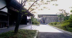
The face of the building appears.
How sober and quiet atmosphere emerged ! Contrary to my expectation that the building was in whitish tone, it was gray as a whole and dark brownish gray on the lower part <2.5m> from the ground. This brown tone sharply matches with the tone of the gate <Black Gate for Inshu Ikeda Family> which is located closely on the left side.
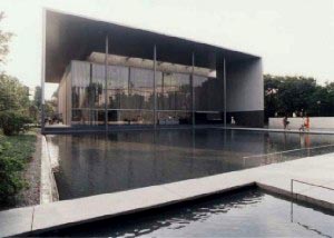
Then appears a pond. A calm rectangular pond. A granite paved route crosses the pond to the front entrance. The granite floor is paved flat as with many of Tanuguchi,s works and has joint drainage.
Approach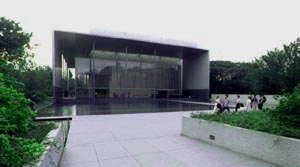 Frontview
The facade is consisted of large gate shaped plate covering over the entrance hall atrium. It is the Taniguchi style by which the space is deepend as though the air current flows through both sides of the building. This might be an extended interpretation of "phenomenal transparency"<note1> , I perceived. And in fact,the space is ascending also. The toplight set on the ceiling of the entrance hall atrium <cloth framed underneath> faces the sky. One may feel and perceive a sense of unity and furthermore, a sense of continuity to a new phase of space. It will not be dark in spite of the gate shaped plate covering the atrium. The lattice glass curtain wall in front reflects the neighboring Greek Roman styled building distorted and dazed. It looks like a big lattice door.
 Front <Cafeteria,s terrace on the left side>
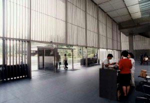
I enter the hall. For a lower part of the monotonous glass curtain wall the lattice is cleared that the pond can be looked out through a large glass wall. It is so simply worked out <with no effusion at all>. Where the lattice touches the floor, it thrusts the floor. The granite floor is hollowed out following the angle of the sash coming down. So thoughtfully designed as if not thought out at all. About 60mm stainless lattice air outlet is fitted. Part of the granite floor can be unfastened for inspection but there is no frame seen at all. The supreme simplicity of detail is here to see. Impressed. Most professional work.
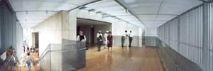
 Entrance hall
 Hall<Landing seen upstairs is the exit of the exhibition room>
The exhibition room is designed in the same "Tokonoma" like style as in the Museum of Kai Higashiyama in Nagano. It is recreated here with more lighting contrasts. The room is down walled using the panel. And the light effect is unique. The light comes from the ceiling where the light fixtures are unseen. It is only natural since fixtures are set on the ceiling.
It is done likewise for illuminating the glass showcases. Condensed light <about 3m higher from the case> is fixed on the ceiling. Since the glass case glazing is so simply done using only grazing compound and no frames, one almost forgets about the presence of glass there. My wife who was the audience there admired that she felt as if she could almost touch the exhibited treasures. I was impressed at this comment and felt that the architect would have appreciated such reaction of the audience.
If the principle theme for modern architecture may be termed as "equal value seen inside and outside", Taniguchi seems to be extending this interpretation to a relation between the exhibition and the exhibiting space. As a result of setting the light apparatus on the ceiling, the whole space turned up neat with no more dazzling light apparatus around. Through the artist,s strain for simple glazing <just the glass>, the most simple glass case was created. And this simplification as a result seems to have succeeded in expressing "the seeing through= the transparency " rather than just the simplification. It made the audience forget about the presence of glass enclosure and gave an illusion of being able to touch. Here he had again created a new relation between the exhibition and the audience. So much impressed. Such discoveries can only be conceived through a real experience.
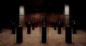
The highlight of the exhibition is the group of Buddhist Images in the glass cases in the second room.
As soon as you enter the room, there appear the Buddhist Images before you all at once. They are about 20~30cm sized and are caught in sight as a group, lined up 7 pieces by 4 in 1.5m intervals. Facing front they are set in such height so that our eyes meet the eyes of the Buddhist Images. When you observe closely the two of the columns are real columns supporting the building<exposed concrete square columns>. And so the Buddhist Images in each of the glass cases are 26 all together. The glass case itself is square column shaped about 2m in height and lined up in equal distance just like the real columns. The room is dark and condensed light is illuminating only the Buddhist Images. It is an overwhelming sight to see the Buddhist Images lined up in equal distance in the darkness. Most impressed. I must repeat my comment about this succesful attempt in making close relationship between the exhibition and the audience.
(And since now the audience is given a happy chance to appreciate the extreme loveliness of these Buddhist Images , why not, an interpreter of Buddhist Images who can explain how and where this loveliness and intimacy comes from and how this is related to the Buddhist principles in Asuka age, is expected to appear. In the pamphlet was a comment that these Buddhist Images had been worshipped at the house of nobilities.)
 The Second Room <copied from the pamphlet>
 The glass showcases looking like glass columns are lined up together with the real concrete exposed columns. This situation provoked my remembrance of the "Paradise" of the Danteum Plan<1940> by Giuseppe Terragni of Italy, where the whole room was filled with glass columns. Taniguchi must have attempted this plan further. When,by chance,I had seen a CG visualization of "Paradise" at Terragni Exhibition I was wondering as to whether these glass columns were just the pure glass or hollow inside or any liquid movement evolving inside.
Taniguchi seems to have presented more aspects. The glass columns don,t support the building but the literature of Dante may have been written in or things related to Dante may have been exhibited in the columns. To realize this imagination he did not construct all the columns but two and instead lined up column like glass showcases in equal intervals.
According to the curator, the architect had participated in the exhibiting work that the lighting effect was strictly checked. The expected number of the audience was 300 for the opening day, but at 3 pm there were about 3000 already and the foods were scarce, he said apologetically. It was truly aimed at to create a calm exhibition.
Where the exhibition ends there is a staircase downward<lattice riser> leading to an air-well void reference room. A big lattice window is set in the southside. Most of the space is taken for your free use of PC and reference desks. The remaining space in the corner was a resting space with couches,so familiar now in many of Taniguchi,s projects. To my impression it was too small a space where the most spaces were occupied by PC. More space for meditation is longed for. Regrets.
There is a cafeteria downstairs. Is it the demand of the age? The terrace is set outside under the light metallic roof.
 3rd floor exit of the exhibition room
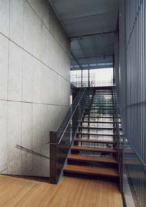 Staircase for reference room
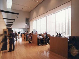 Reference room
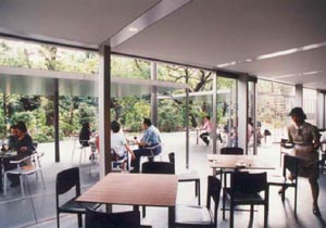 Cafeteria
On the way back you are faced with the Tokyo National Museum of Orienal Art<1968> designed by Taniguchi,s father, Yoshirou Taniguchi. Here you will notice the lattice at once. It is a noticeable characteristic of Taniguchi using the lattice for Museum for Horyuji Treasures, and it was just the trace of his father,s style. I now can perceive his strain for the simple and monotonous lattice used in his other projects. And also his style of using rectangular shaped eaves which create depth in space seems to derive from what his father was doing in his housing projects. It was certainly remaking the deep eaves characteristic in traditional Japanese architecture into modern aspect.
P.S.
On both sides of the windbreaking room in front were umbrella stands set and it was quite bothering visually. There are spaces spare on the sides.
(Note1) Phenomenal Transparency
There are literary transparent materials such as glass and acrylic resin. By contraries there are ways of formation of virtual glass like transparent film even though there is nothing in real there. We call this formation, "phenomenal transparency". For example, here a gate shaped eaves is bridged and several columns are set and as a result you will recognize as though there were a transparent film<the glazing is possible of course>. You will be extending this sense complicating this film like virtual space. It is done so with the gate shaped eaves making virtual spaces flowing through both side and setting up the toplight <glass glazed for real> which is leading ascending spaces toward the sky. It is also making the virtual duplicate plane with the lattice glass wall.
Where the glass is grazed there are no frames or frames are not noticeable and all these works seems to express his approach for the virtual or phenomenal transparency. The quest of modern architecture, that is the equal value and the continuity of spaces inside and outside are here to see.
Oh, I have mentioned on the formative explanation again.
Return Home
